
- 3
Data for story
In this blog, I will be focusing on creating a story and understand how to acquire and wrangle data. For this I will be using data in an excel file.
Once data is acquired, I will create an insightful dashboard with interactive charts, table and perhaps geo maps.
Before I go further, let us describe what is data wrangling?
It is a process of transformation of data. One raw data element is transformed and/or mapped into another format. The intent is to enrich it and/or make it more appropriate and valuable for a variety of purposes. One such purpose being analytics.
In here, I will be using an excel file with sample salary data. Using this data, I can analyze the data by department and regions.
The sequence that I will follow is
- Import data file
- Explore data
- Manipulate data in grid view
- Transformation in grid view
- Create level based hierarchy
- Map geographical information
- Create a story, interactive with input controls
- Enrich visualization with variances and thresholds
- Additional styling of the dashboard for visual appeal
ACQUIRE AND WRANGLE DATA
I will now log on to SAP Analytics Cloud (SAC).
You can get trial account for 90 days, using this link, https://www.sapanalytics.cloud/try-for-free/
|
Log on and home screen |
|
|
|
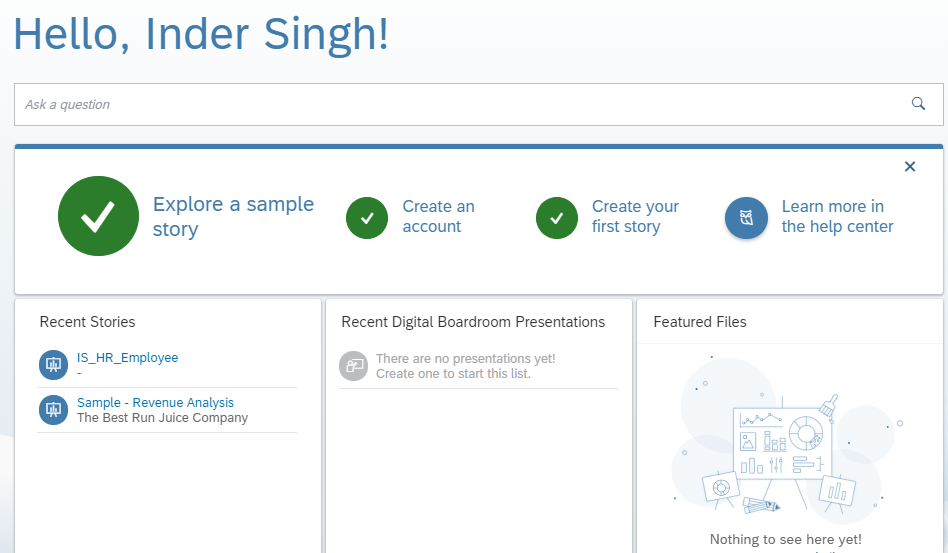
From home page, I can explore a sample story, create a new story, view my recent stories/boardrooms and use Search to Insight |
|
To get started, I will click on “Create your first story” tile
|
|
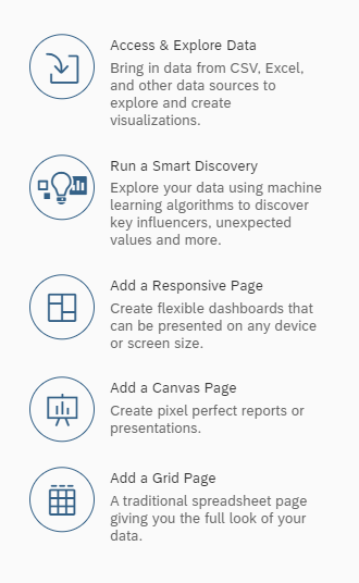
In the next page, I can import my data. And also I have option to run smart discovery, add a canvas, responsive or grid page, or begin creating a story using templates provided.
|
|
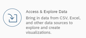
For now, I am interested in Accessing and Exploring Data from my excel file. So I clik on “Access & Explore Data” tile
|
|
Next screen gives me option to choose from where I want to get my data, from a File, from a Data Source an Existing data set or model |
|
I click on from a file tile |
|
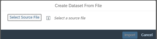
Then I am prompted to browse and select a data file
|
|
I browse to select my data file and click on Import |
|
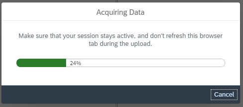
Wait while SAP aquires data
|
|
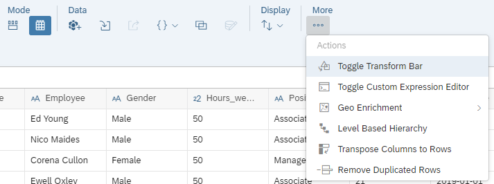
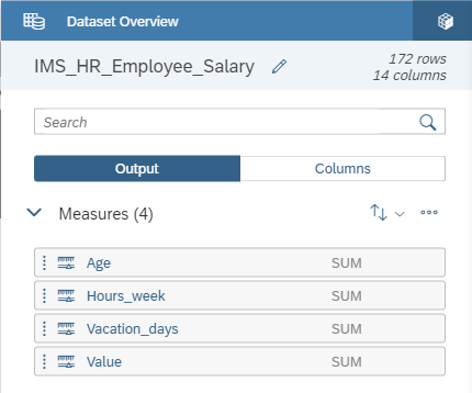
Once data is imported to SAC, it shows up in grid view. Here data manipulation provides the ability to configure what is measure and dimension, and allows to correct any mistakes in dataset. |
|
The upper section of the screen provides the set of tools, like, create Geo dimension, Hierarchy, and more
|
|
Next, below the toolbar, there is Transformation bar. This allows to transformation like concatenation, spliting etc. on a column
|
|
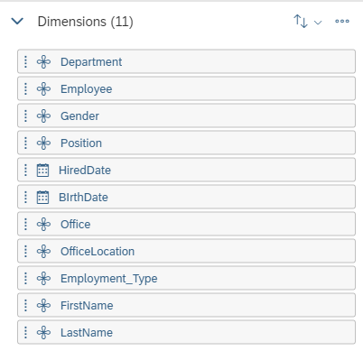
Then there is a details panel on right side, that is helpful to understand the data within a column. It highlights any errors and displays the data distribution, like number of rows, columns, measures and dimensions
|
|
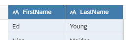
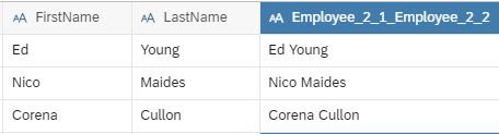
Next, I want to combine employee first name and last name to form combined employee name. This will be usful in visualization based on name column. |
|
Using CTRL key, select both FirstName and LastName column, in the data grid
|
|
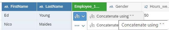
Click on Transformation icon |
|
And hove over Concatenate columns with “ “
|
|
When I hover over, the grid shows me preview of the data as it would be when concatenate option is selected. This helps to verify how the new combined name column will look like. In above screenshot, I see that I am combining two Blue colored column and this creates a new column, shown in Green color. |
|
Next, I click on Concatenate Column with “ “ to finalize the transformation
|
|
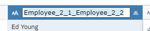
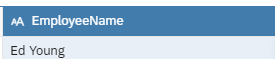
Next, I will double click on this new column name and give it a propername
|
|
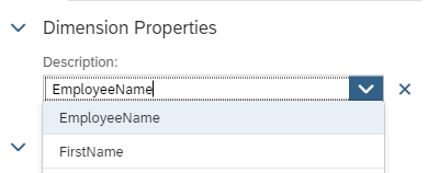
Next, I want to use EmployeeName column as description for Employee (employee id) column I select Employee column, and in Details panel on right side, I click on |
|
This bring panel for details of selected dimension, showing Dimension Properties & Column Details
|
|
From Description drop-down of Dimension Properties, select column EmployeeName
|
|
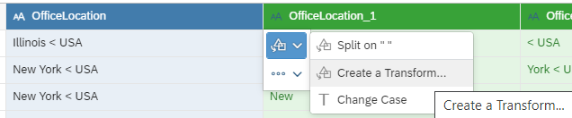
My data also has City, State and Country, that I can use for creating Level Based Hierarchy. But, State and Country are combined in single column, that I need to split. I select OfficeLocation column, click on Transformation icon and hover over Split on option to preview the data But I do not want to split on space, but on character “<”, so I click on Create Transformation
|
|
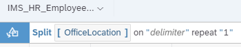
This takes me to Transformation Bar, with transformation formula in there
|
|
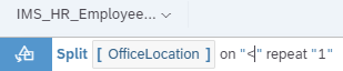
I replace “delimiter” with “<” And click OK |
|
Now I have State and Country split in two column, just as I want them to be
|
|
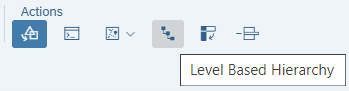
Now I have proper column for level based hierarcy, Office, State, Country From tool bar, I click on Level Based Hierarchy icon
This opens a right-side panel for defining hierarchy |
|
Next, I select dimensions of my hierarchy and give this hierarchy a name and click OK
|
|
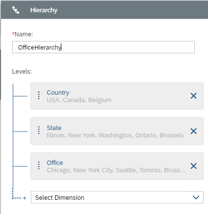
Now I can see newly created hierarchy in Details side panel under Dimensions
|
|
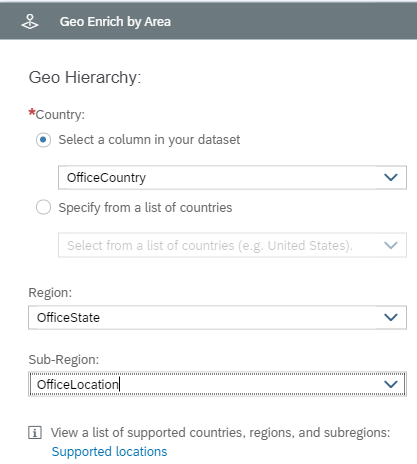
With this enrichment, my dataset has area based geographical information that I can use in my visualizations
|
|
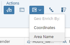
In Geo Hierarchy, select OfficeCountry, OfficeState and OfficeLocation
Click OK to complete |


 OR
OR


 icon for Employee dimension
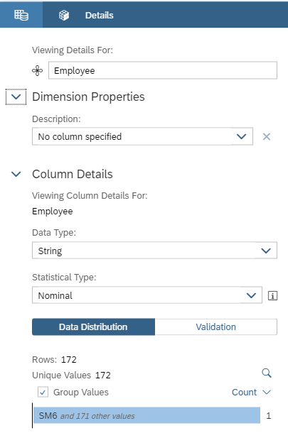


Thus far I have done following
- Import data file
- Explore data
- Manipulate data in grid view
- Transformation in grid view
- Create level based hierarchy
- Map geographical information
CREATE VISUALS – I will cover this in my next blog